Overview
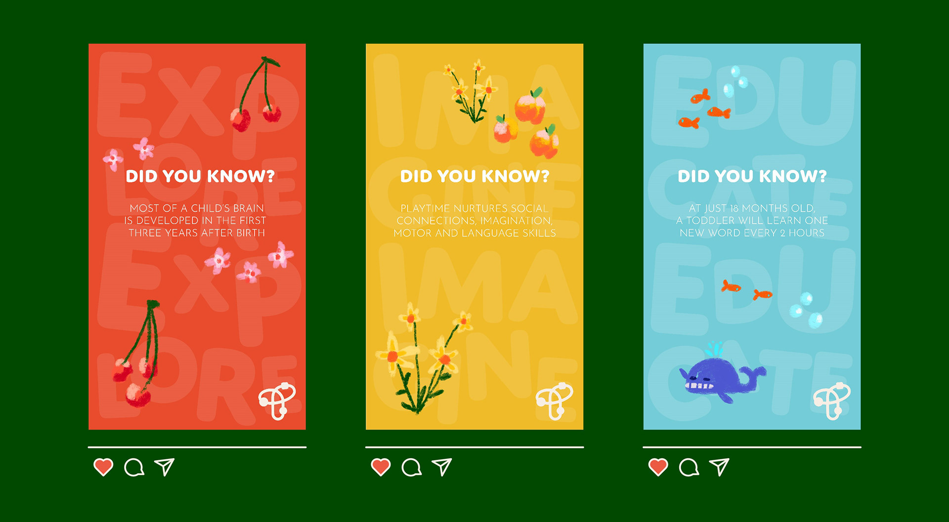
T for Tots is a concept daycare brand whose mission is to cultivate an environment where children are able to grow with confidence. A child's early years are crucial to set a solid developmental foundation. To prep for success in the future, T for Tots strongly educates on core skills like socialization through the use of play.
T for Tots is inspired by the common phrase used to teach children the alphabet (Ex, A for Apple). To achieve a playful visual personality, the brand uses hand-drawn imagery and bubbly typography.
Mediums Used: Illustrator | Figma | Adobe Aero | Procreate | After Effects
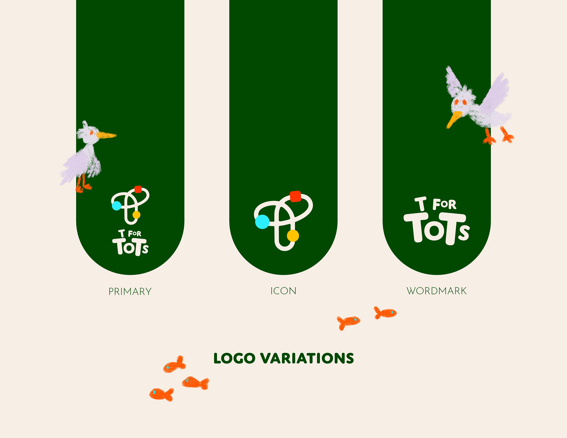
The Logo
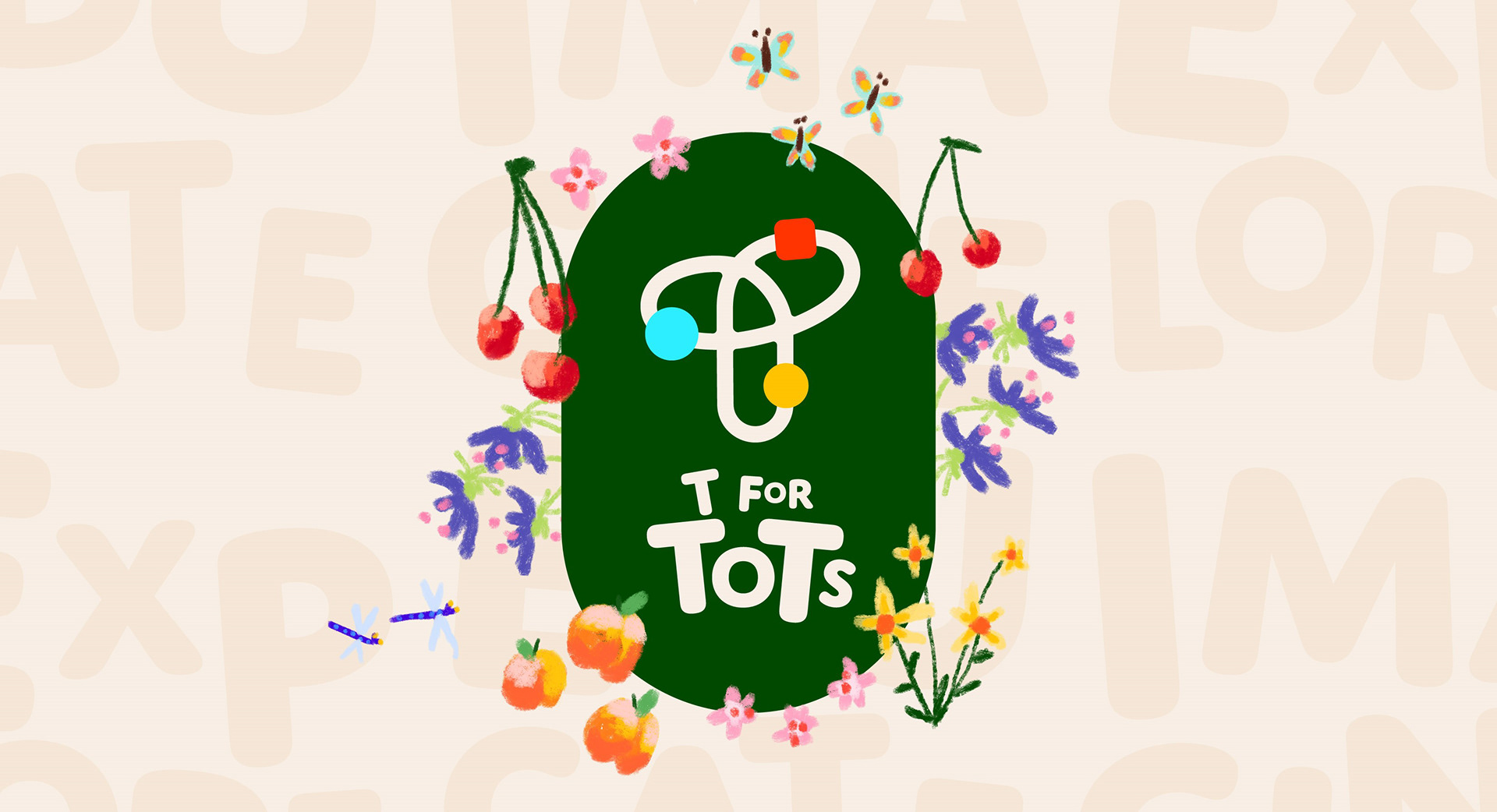
The logo has different meanings to represent the brand. Its appearance resembles the popular bead maze toys that toddlers play with. The beads are arranged in a path that encircles a center point which imitates the way atoms surround a molecule, which also is in the shape of a T. The combined imagery emphasizes the fact that T for Tots is a place that prioritizes childhood development, and education through the use of play.
The logo has different meanings to represent the brand. Its appearance resembles the popular bead maze toys that toddlers play with. The beads are arranged in a path that encircles a center point which imitates the way atoms surround a molecule, which also is in the shape of a T. The combined imagery emphasizes the fact that T for Tots is a place that prioritizes childhood development, and education through the use of play.
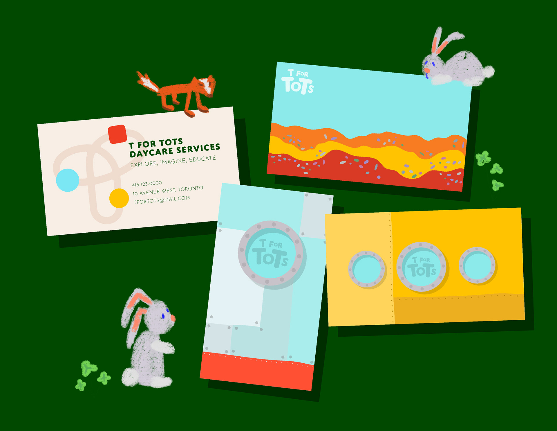
Augmented Reality Business Cards
The business card uses augmented reality to add an interactive element to the customer. When pointing a camera at the card, it comes to life and resembles a flashcard that children use to learn the alphabet. Not only will the card contain info about the business to parents, but toddlers will find enjoyment in interacting with the card.

Website Mockup and Prototype
The T for Tots website mockup showcases what a site would look like using the assets and branding established for the company. Interact with the Figma prototype below!
The T for Tots website mockup showcases what a site would look like using the assets and branding established for the company. Interact with the Figma prototype below!