Overview
Oinko is a concept credit card application that was created to appeal to a young demographic. The visual language used in this project reflects Oinko's core values of transparency, quality, and simplicity - with the glass piggy bank representing these traits. While creating the branding and mockups, I wanted the look and feel of the product to highlight these traits and also present an innovative design push to the traditional finance sector.
Mediums Used: Figma | Blender | After Effects
Defining the Problem
The goal of this project was to create a user experience that was intuitive, simple, and also made some improvements to current products in the market. To start, I did a competitive analysis of other mobile banking apps to see what they did well, as well as places to provide improvements.
The goal of this project was to create a user experience that was intuitive, simple, and also made some improvements to current products in the market. To start, I did a competitive analysis of other mobile banking apps to see what they did well, as well as places to provide improvements.
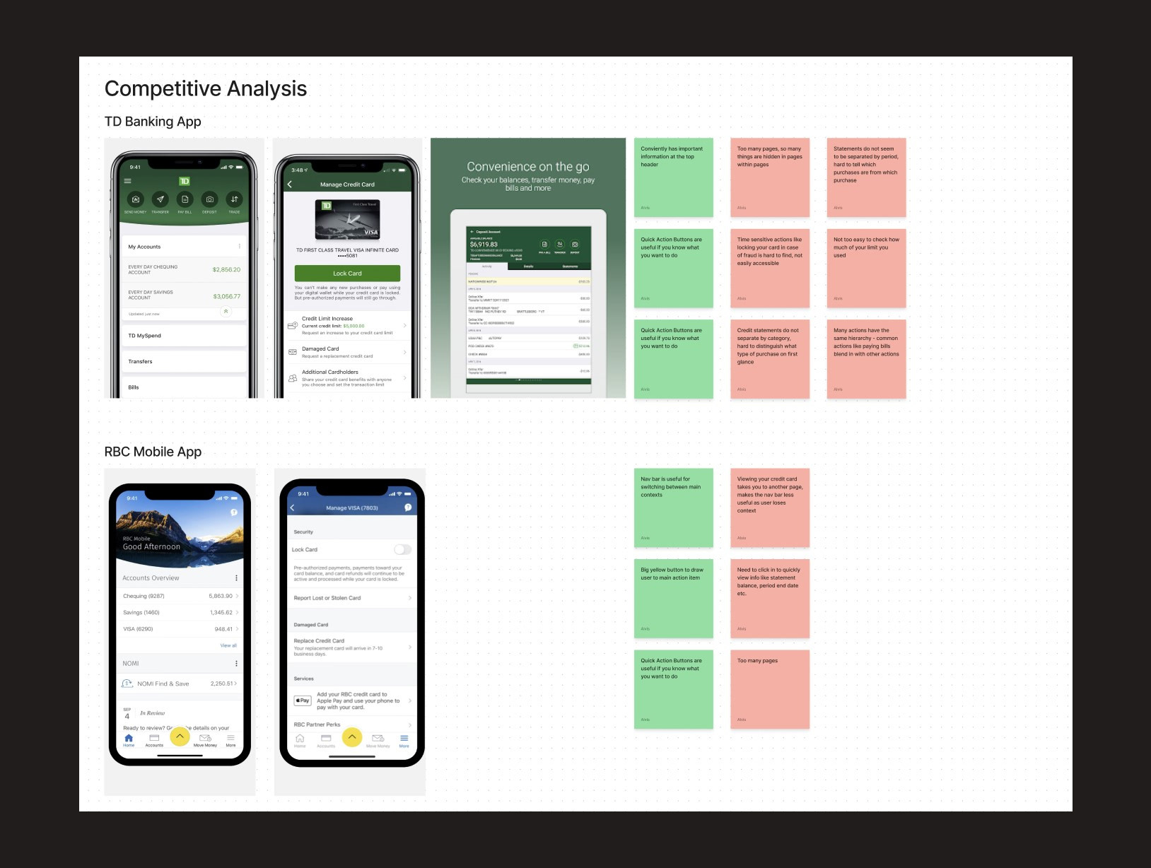
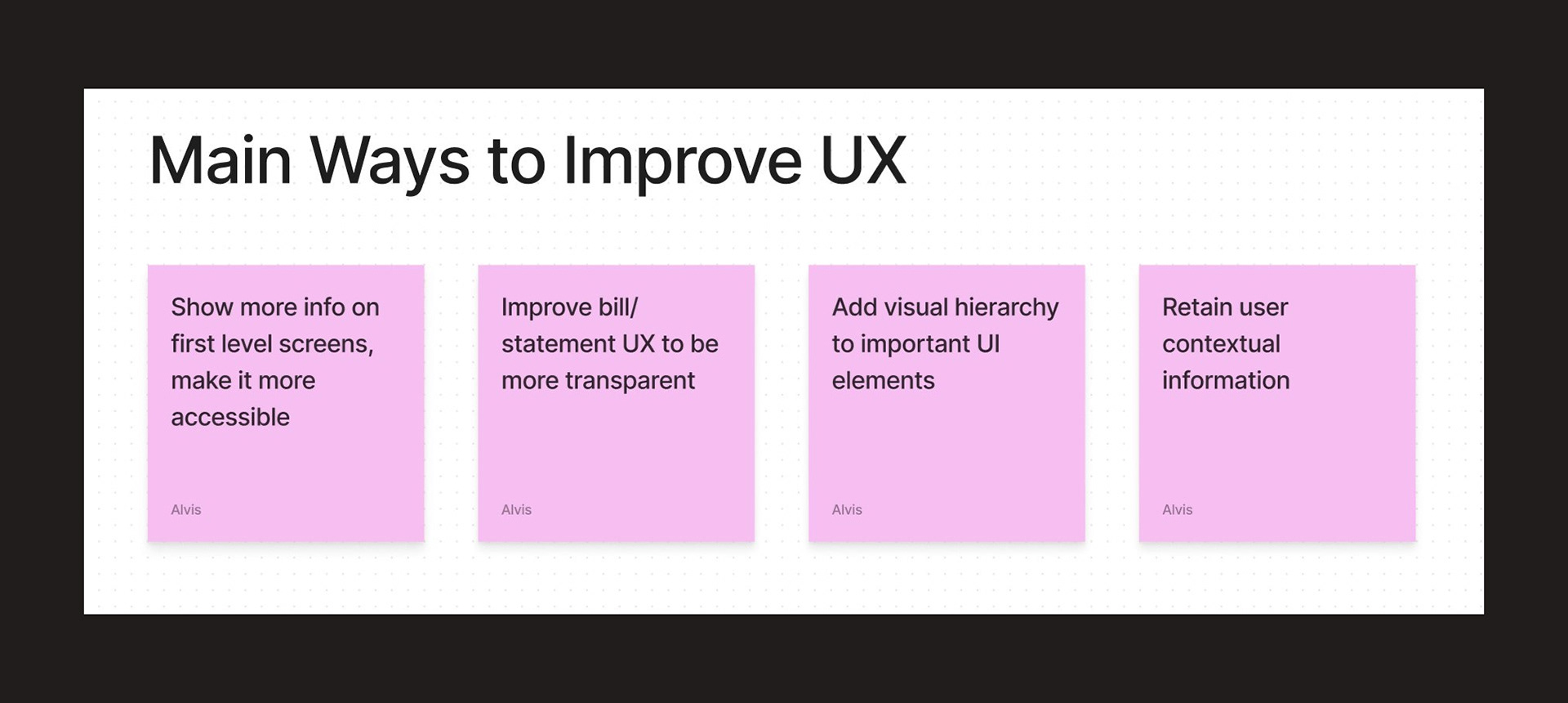
The analysis brought up some common themes that were seen across many applications. Information accessibility and transparency came up as a way to distinguish the application that I wanted to create.
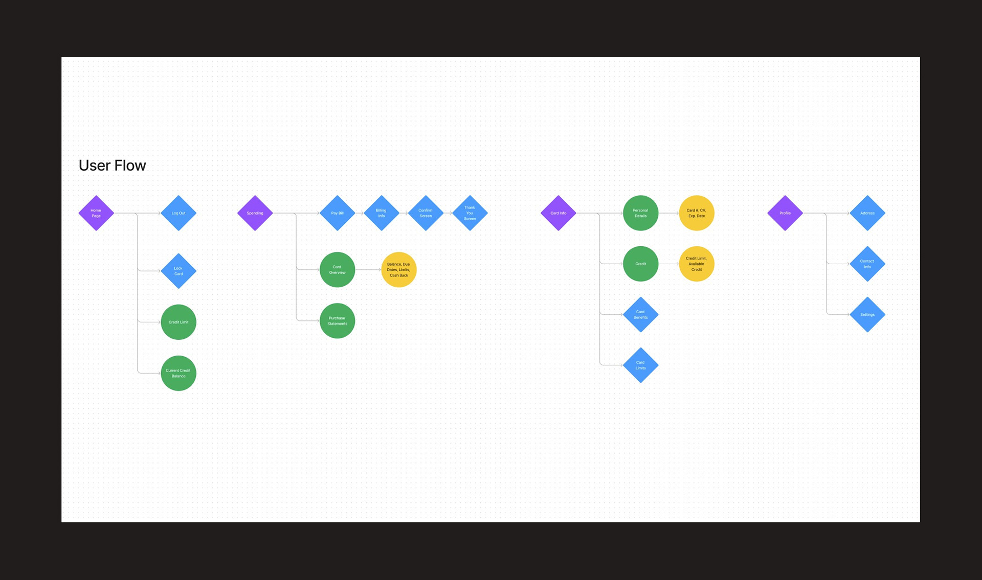
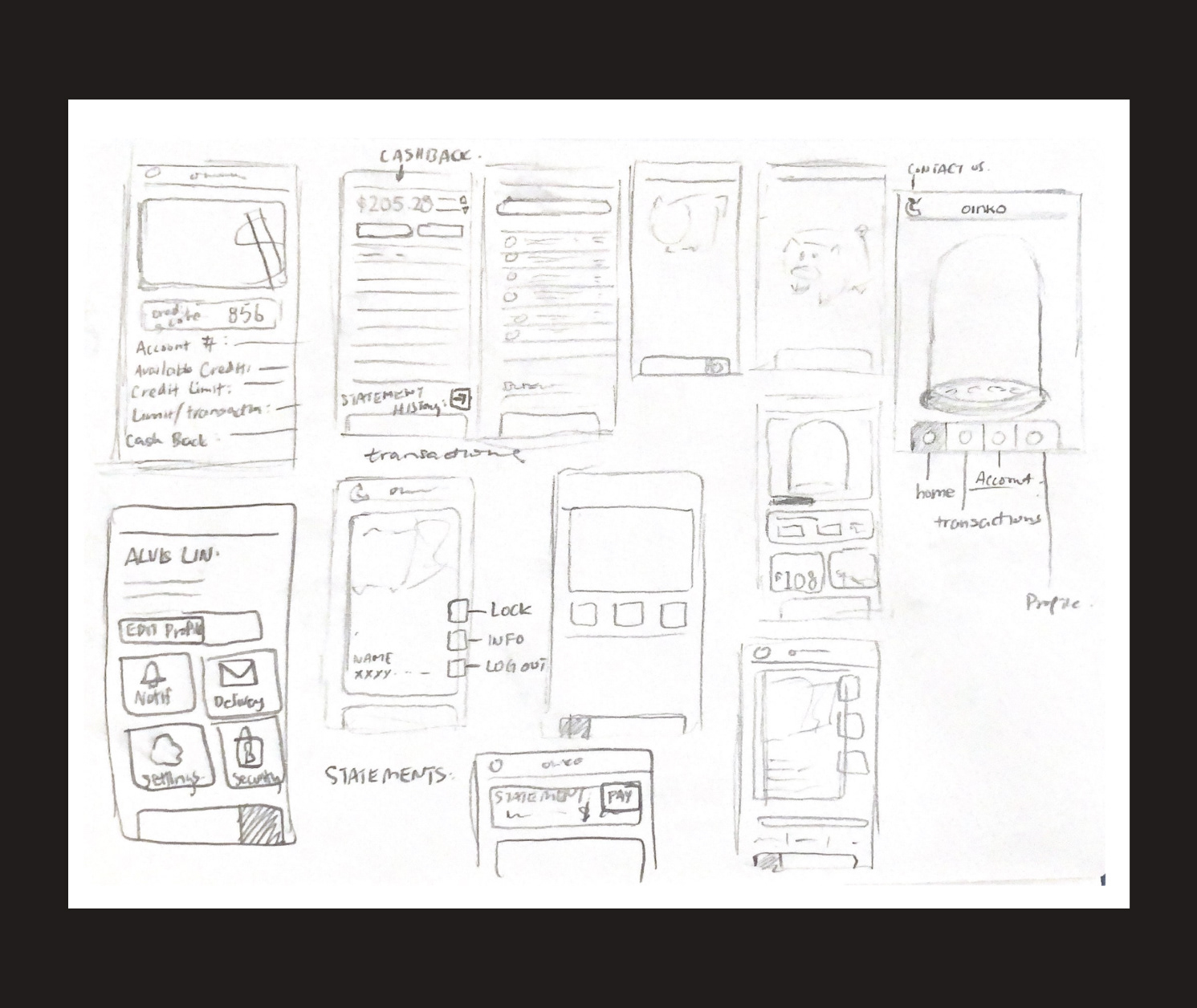
Ideation
User flows and rough wireframes were created to aid in the design process. While sketching out the wireframes, an emphasis on information accessibility and visual hierarchy was placed in order to meet the goals of the project.
User flows and rough wireframes were created to aid in the design process. While sketching out the wireframes, an emphasis on information accessibility and visual hierarchy was placed in order to meet the goals of the project.
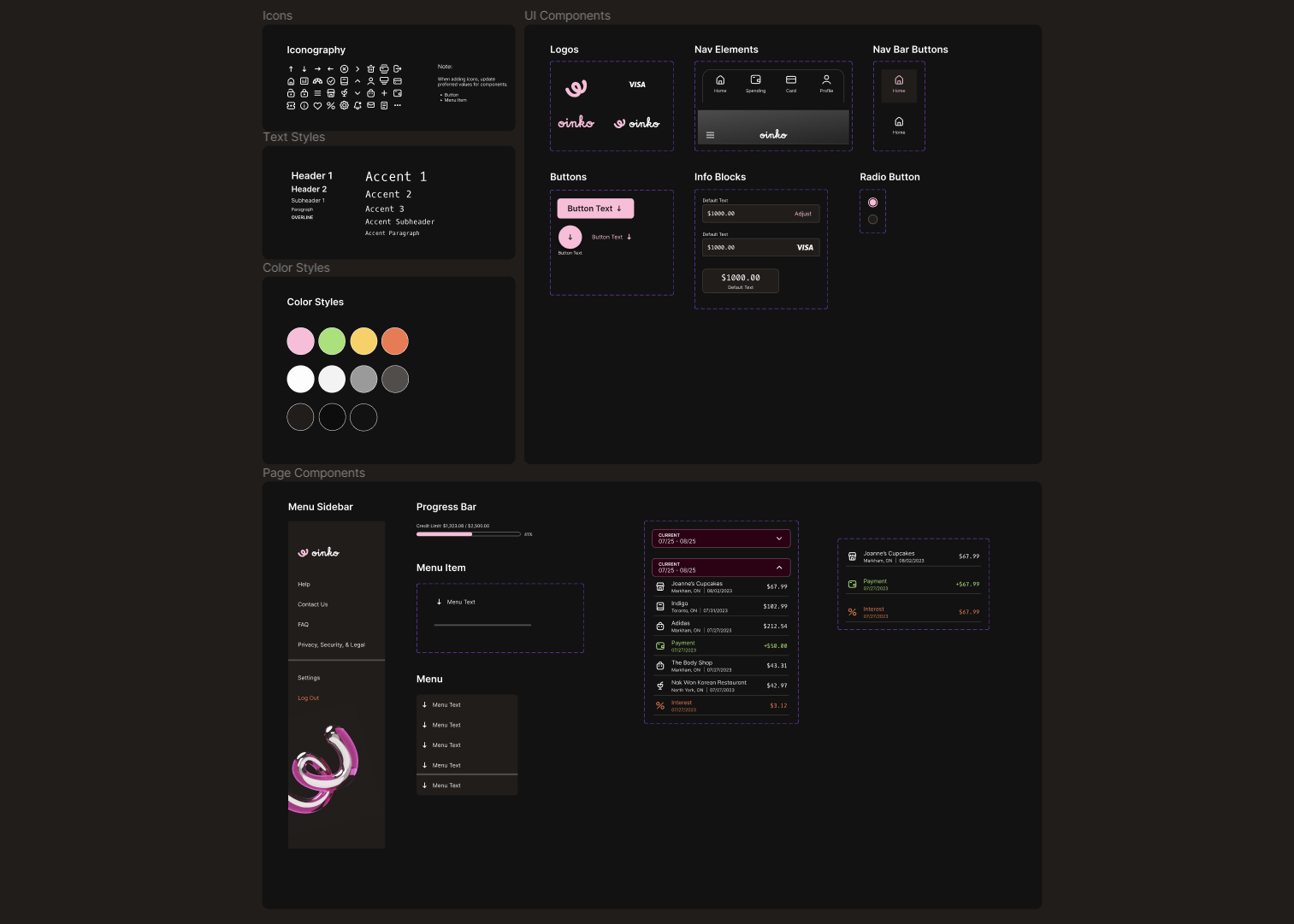
Component Library
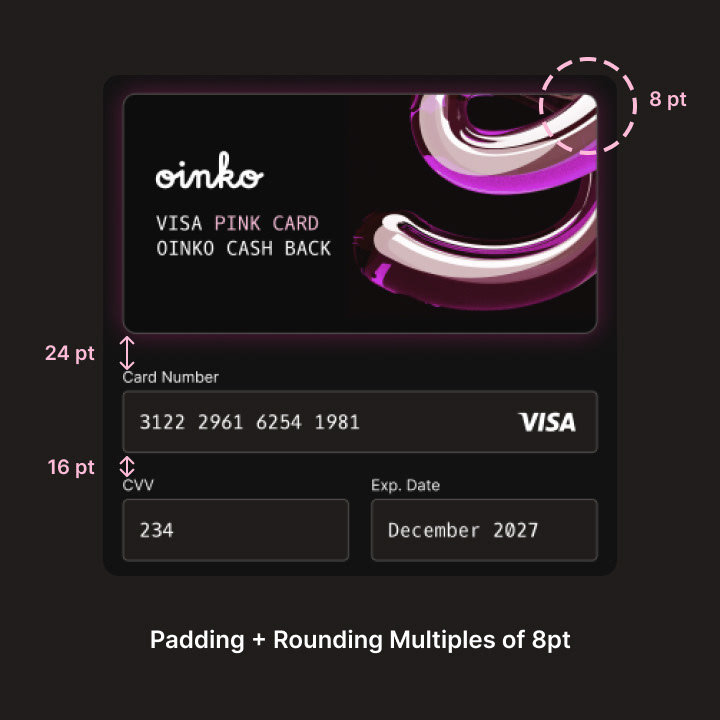
A design library was created in Figma to ensure that everything is consistent in visual language. The library acts as a building block for creating more complex mockups and prototypes, as well as streamlining the design process. All the elements are custom-made, with the exception of the iconography.
A design library was created in Figma to ensure that everything is consistent in visual language. The library acts as a building block for creating more complex mockups and prototypes, as well as streamlining the design process. All the elements are custom-made, with the exception of the iconography.
Mockup and Prototyping
High-fidelity mockups built upon ideas from the wireframe process. After going through multiple rounds of iterations, a final set of mockups was then prototyped to test all the elements working together. Interact with the prototype below!
High-fidelity mockups built upon ideas from the wireframe process. After going through multiple rounds of iterations, a final set of mockups was then prototyped to test all the elements working together. Interact with the prototype below!
Results
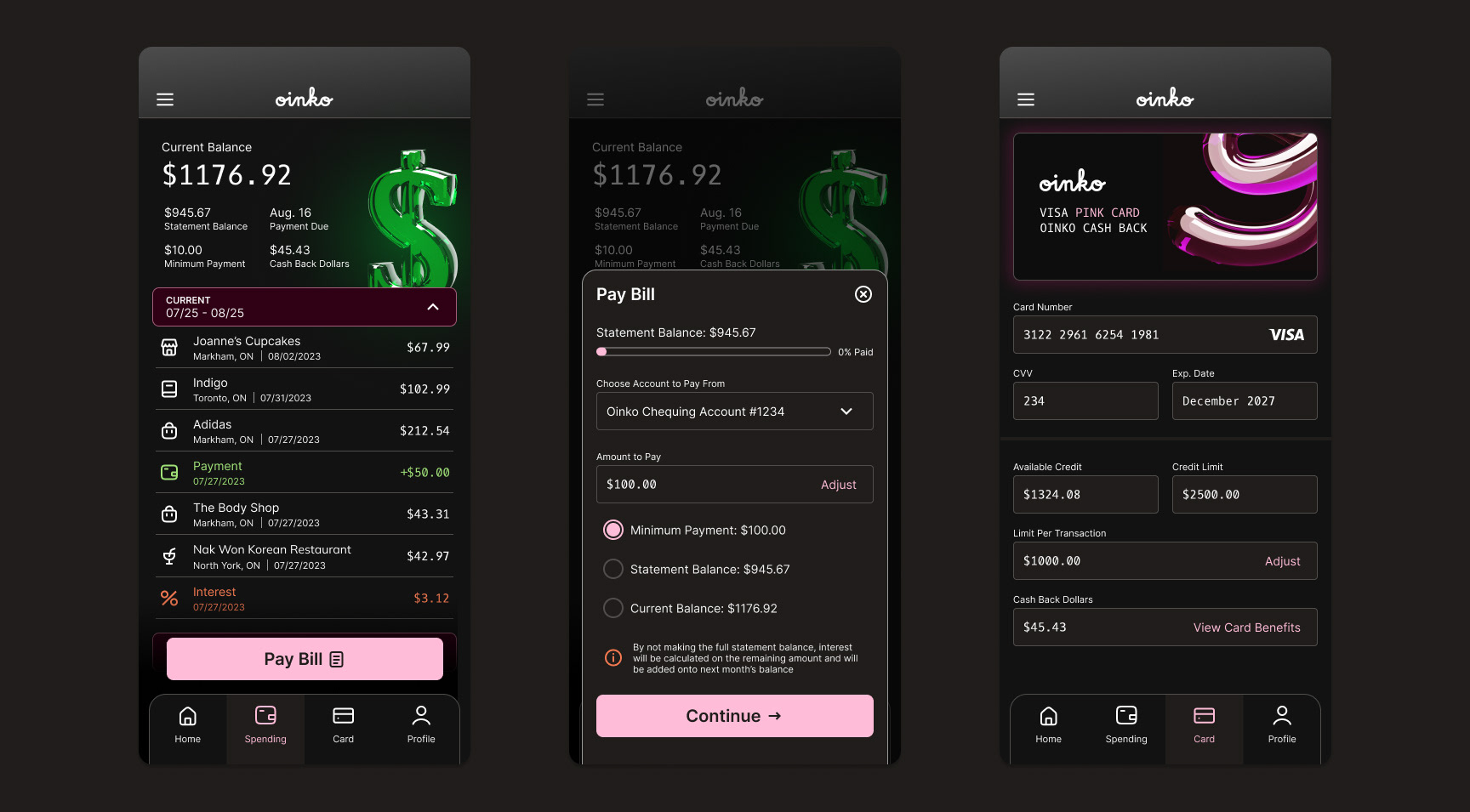
Modals were a big interface element that was prevalent throughout the mockups. They were used as a way to keep contextual information for the user while performing related actions. For example, paying a bill will pop up a modal instead of opening a new page, which keeps the user in the context of the "spending" tab.
Modals were a big interface element that was prevalent throughout the mockups. They were used as a way to keep contextual information for the user while performing related actions. For example, paying a bill will pop up a modal instead of opening a new page, which keeps the user in the context of the "spending" tab.
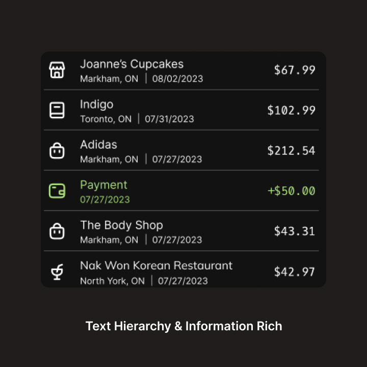
Visual hierarchy is another area that the designs focused on. Because the goal was to make more information easily accessible, it was important to be able to show information in a way that did not crowd the UI. Information that can be grouped together (like items spent), are put under a dropdown tab. Main actions (ex. the button for paying a bill) appear as the largest UI element at the bottom of the screen. This makes important actions easier to find as it it near the user's thumbs.